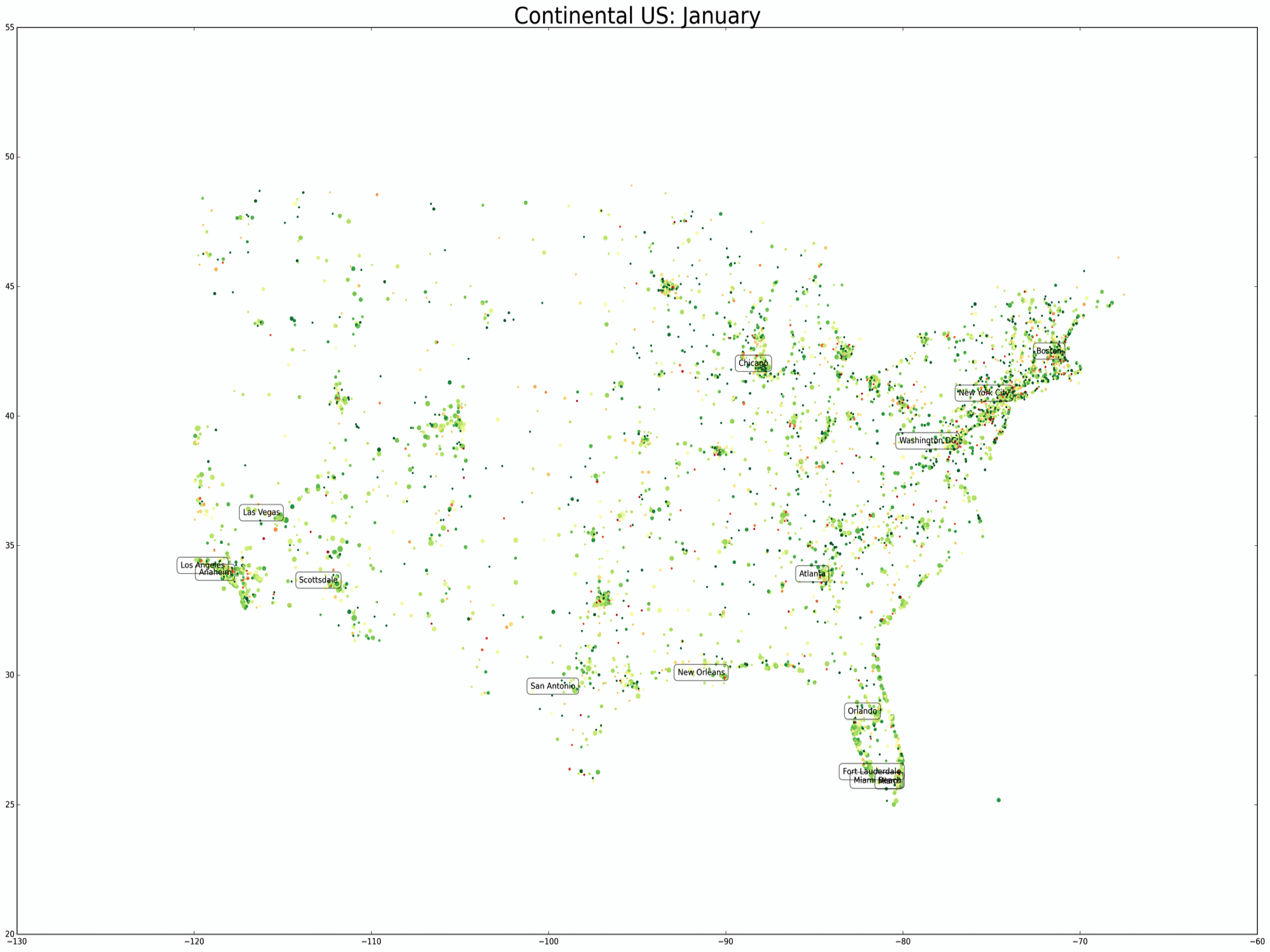
Last time, I stopped with a preview of a TripAdvisor data on an animated gif map of the US. Here it is again:
(Click to enlarge)
I think the patterns in the timing of reviews (which I assume to approximate when people travel) are quite subtle, yet obvious. But when the obvious is visualized, it is generally more impactful. Take for instance, the map above. As a recap, green means high ratings, red means low ratings, the size of the dots represent a log scale of the number of reviews. The first thing I noticed when plotting this data is the incredible density of travel destinations on the East Coast. As someone who grew up in the Midwest and moved to the Desert Southwest, this was not surprising yet still eye opening when put on a map. The second thing I noticed is the vast emptiness across all months between the Rockies and the Mississippi River. Basically, the empty regions in the US are filled with farmland. The third thing across all seasons is that people are drawn to the coast. However, there’s a difference between the West Coast and the East Coast. The East Coast doesn’t have one concentrated area where people visit, while the West Coast tourism is mostly concentrated in SoCal and the Bay Area. There’s almost no beach tourism north of SF. The eastern coastline is littered with tourists from Maine to the Keys. What about seasonal variation? Like I mentioned last time, there’s a subtle pattern of travelers moving south during the colder months and north (and to the Rockies) during the warmer months. Denver and Sedona seem to trade off traffic as cold weather descends upon the Rockies. Again, not mind boggling, but nonetheless interesting to see from real, messy, crawled data.
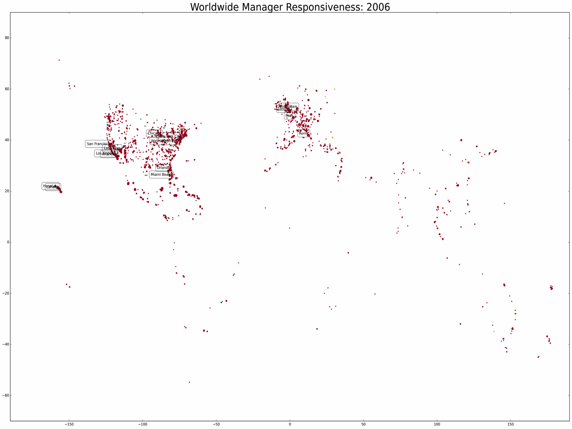
Let’s look at something we think less about. How responsive are hotel managers to online complaints? Let’s look at the world, first.
(Click to enlarge)
One of the focuses of my most recent work is trying to measure the impact of management response to a word of mouth community like TripAdvisor. The first thing my coauthor and I wanted to see was how prevalent was management response behavior. It turns out that in the current state of affairs, management response rates are much higher than we had originally anticipated. For the hotels in our dataset, the most recent response rate on TripAdvisor is over 50% worldwide. In the plot above, we’ve plotted destinations over the course of nearly a decade on a long-lat grid. Like the previous gif, the size of the dots on this figure is proportional to the log of review count. However, we’ve created the map such that the color scale represents the percentage of hotel reviews with response. We chose the cutoff for green to be 20% for illustrative purposes so that any destination with at least a 20% response rate will be shaded with the darkest green. I think it is fascinating to visualize the rapidity with which management response becomes an adopted standard practice worldwide. In fact the diffusion of this management practice is the focus of our next project with this data. We are currently answering questions like: What factors facilitate management practice? Does adoption by large chains help introduce a practice to new geographic regions?
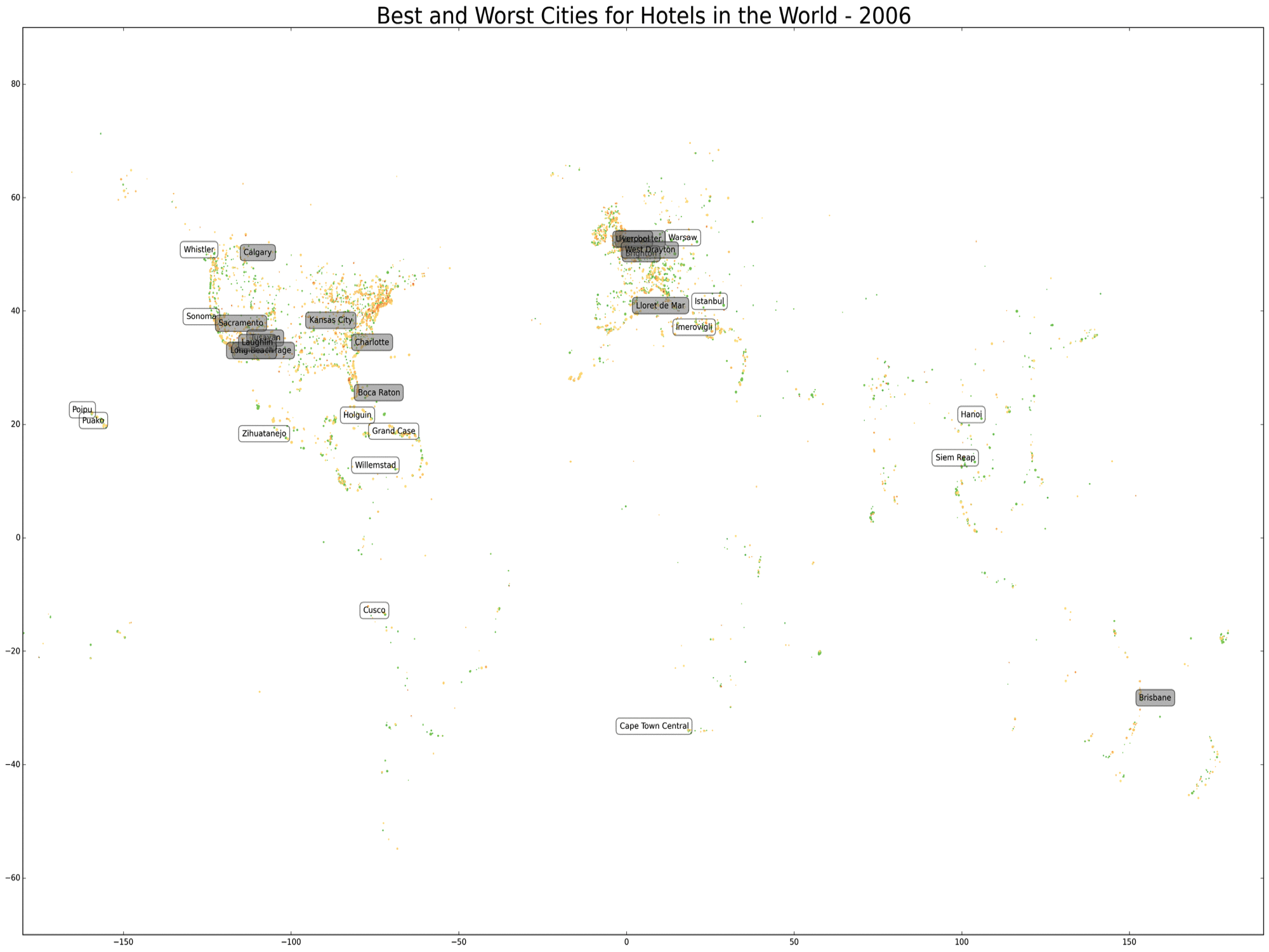
One more map. This one was made due to my own travel bug. I wanted to know what destinations have the world’s best hotels.
(Click to enlarge)
The map above shows travel destinations as dots whose size reflects total number of reviews. The color scheme goes from red to green for poor to good hotel ratings. I’ve demeaned hotel ratings by the individual rater’s average rating. I’ve also labeled the top 15 best and worst hotel destinations for locations that represent the top 10% of destinations by number of reviews (think best and worst popular destinations). It’s pretty clear that the best places for hotels are not in the UK. Southeast Asia and the Caribbean, on the other hand, boasts some of the best resort cities. One thing that I may look into further is whether the cost of hotel development correlates with the average quality of hotels in a city. I will also create and post similar GIFs for restaurants and things to do in the near future.

Thank you forr writing this
LikeLike