My paper with Alex Chaudhry on management response to online reviews draws heavily upon crawled data from TripAdvisor. We began collecting data looking at Las Vegas hotels, a good starting source for sampling travelers from around the world. Everyone’s been to Vegas, and Vegas guests have been literally everywhere:
We created the above plot by plotting the reviewed venues’ longitude and latitude coordinates on a 2-D platform. Yes, it is a slightly distorted projection, but I think it’s safe to say that our panel of consumers have traveled just about every tourist spot in the world.
Sampling issues aside, what can we say about review tendencies given the information that we can glean from users’ profiles? Let’s first look at some basic demographic splits. Who are more positive, men or women?
 I suppose it’s not too surprising to see that men tend to be more negative than women, or is it? I don’t have a great working theory for this, but it seems like men tend to be more likely to write a review to complain about an experience than women. Note also that the average length of reviews are also slightly longer for women. This is surprising, since one would expect positive reviews to be shorter than negative reviews. I would expect that there are more specific things to say when encountering a bad experience. I’ll just chalk this one up to gender differences in expressiveness.
Perhaps, the most startling thing in this chart is the big drop in word count and ramp up in average ratings in 2011. I have yet to confirm this directly with TripAdvisor, but it seems like their iOS app launched in 2011, allowing reviewers to rate and review venues on the go from their iPhones and iPads. This introduction would likely explain both effects. With the working assumption that negative reviewers are more motivated to write a review, most marginal reviewers should be more positive than the randomly selected reviewer. Given this assumption, and the fact that a mobile platform reduces the cost to writing a review, one would expect higher average ratings. It goes without saying that reviews written on a mobile platform should also be shorter. In addition to impact on review ratings and verbosity, if the mobile hypothesis holds, then we should see a rapid increase in number of reviews during the same time frame.
Looking at the figure above, it is pretty clear that there indeed is a big ramp up in the number of reviews per month beginning in 2011, especially in restaurant reviews. TripAdvisor, which started as predominantly a hotel review site, now collects more restaurant reviews than hotel reviews. At the same time, the broad “things to do” category is quickly catching up to hotel reviews.
We’ve seen some gender differences in basic review statistics. What about differences between age groups?
 Well… no. It’s almost astonishing how similar the distributions of ratings across age groups look. In fact, I did a double check by hand to make sure my eyes weren’t glazing over in the darkness of night.
OK, enough of the boring stuff. Let’s go back to maps for a preview of the next post. Can we observe changes in travel behavior at the geographical level? Let’s take a sneak peek at US travel by month:
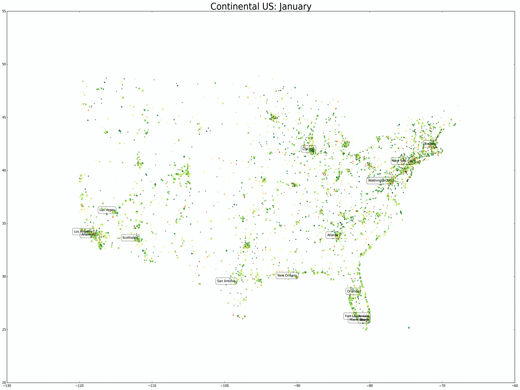
We can see how tourists migrate south (Florida & Sedona benefit most) in the winter months and move to the temperate climates during the summer months. What else can we glean? Tune in for the next blog post to find out!
